So - I decided about a month ago, to try and complete a quilt in two months, for my daughter's graduation (getting her MBA from Boston University!). I was inspired by the book, Adding Layers by Kathy Doughty.
Kathy is a master quilt designer - she has a keen eye for just the right mix of color and print, which I love.
In the book, I decided to make this quilt, called Follow the Sun. I chose it because of the (mostly) simple construction, and only 12 blocks to make. I simplified the center of the star blocks which, I realize, takes away from a big part of this quilt's cool factor - but I am on a time limit, so I decided to go for it. I started great, with an acid green and dark violet combo, and a blue (paperweight) print (Kaffe) for the middles of the stars. But I still needed a background (Kathy used the black/tan mini dot), and I found a plummy/white floral. I was set, right? NOT!!! I still didn't have something to be the sashing and outer borders.
So off I went, to my local fabric shops - we have lots of them in the western suburbs of Chicago, and I have visited many! How tough could it be? I KNEW what I wanted, a big splashy print, darkish in tone (NOT lots of which), perhaps printed in long horizontal bands of viney flowers, to use as borders. Easy. Nope.
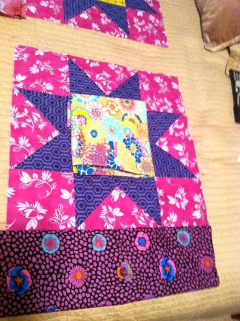
I laid my "finished" block (I am falling out of love with my block, stay tuned) on various fabrics to try out. (these options are in no particular order)
Choice 1 - blue circle print. I like how it pulls the blues out of the paperweight print. But otherwise, it sort of sits there.
Choice 2 - Plum and blue floral "bees knees" print, which I do love - it has that "hippy dippy" vibe I am going for, prints that speak to each other but don't have to actually match. Shown with more of the dark violet as perhaps an outer border or binding. Not wild about how that acid green jumps out at you.
Choice 3 - A nice mauvey print with some blue, like how it blends but not matches. Very hippy-ish too. Still not liking that acid green - the color yells at you, plus the print is so modern.
Choice 4 - Redo the middle with this totally yummy chartreuse print (wish I could give credit, is it Kaffe?) as the middle background, with this black dotty/spotty print. Hummm, maybe we're getting somewhere.
Choice 5 - shows that chartreuse middle with a mockup of the middle fabric (just folded under, sorry), and the mauve print as sashing. Could be?
Choice 6 - Swapped out the middle background for the mauvey print, and now chartreuse print as sashing. Me likey. Also, using the dark violet to create smaller stars at the intersection of the sashing strips.
Choice 7 - Not really in the running at all, but I'm showing it anyway. It's the "type" of print I was searching for, with long bands of some sort of design. The colors are great, dark blue, plus, and lime green, but way too much white for me. I toyed with fussy cutting and appliqueing it on another color - stop, way too much time involved!!!
Choice 8 - My original block on the plum bees knees print. Not terrible, but not balanced. The dark violet and acid green are stronger than the other more muted prints.
Choice 9 - "That" chartreuse floral print (which is so beautiful, I love how it introduces aqua and orange to the mix) as sashing with the original blocks.
Choice 10 - Chartreuse sashing with the dark violet corner stars. (spell check does not understand the word sashing!!!)
So, friends out there in blogland - thoughts? I do think I will redo my star middles with a different background square...I am also toying with using TWO different sashing fabrics. maybe one for the vertical and one for the horizontal, to hippy it up a little more.


